This post is focused on the shiny surfaces in the kitchen. Right now nearly all of the objects are in boxes and may be installed in the next week or so.
Faucet—Before I saw one up close, I thought I would like one of the commercial faucets with the fancy sprayer. Those things are huge and I want to keep things simple and open. I am very happy with the faucet in the old kitchen because the faucet head swivels as does the arm, so you can reach the whole sink area. This Kohler chrome faucet in no longer in production, but a few of them still exist in inventory. The flat wing shaped handles make it easy to turn the water on and off with the back or side of your grimy hands . Their shape makes them easy to wipe clean. Kohler no longer makes the same handles that I have now so I am going to switch the old handles to the new faucet. Below are the old and new versions.

Kohler faucet with the older style wing handles. I will take these from the old faucet and put them on the faucet in the new kitchen.

Kohler faucet with the new version of the wing shaped handles. I will put these handles on the old faucet
Lighting—Decorators like to “layer” the lighting: general lighting, task lighting, accent lighting. By the time they are done, the ceiling is full of pot lights and throughout are fixtures that are hard to clean and with bulbs located in delicate shades. Here is an example of what I mean in an otherwise wonderful kitchen.
Pardon me while I rant. Nearly all islands or peninsulas in new kitchens are lit by three pendants and counters lit by under cabinet lighting. I can only imagine the bank of switches that control everything. None of this for me. In addition, I am committing the worst lighting sin by having a fluorescent fixture in the kitchen area. I have one now and it works fine with no shadows cast. Fluorescent bulbs get a bad rap because old ones cast a bluish light and people didn’t like how their skin looked in the light. Nowadays bulbs come in a wide selection of temperatures so they all don’t have that blue cast that people complain about.
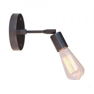
For a bit of bling, over the windows will be two sconces made by a company called Cedar and Moss. The finish in the image below is matte black and bulb is an Edison bulb. The Edison bulb is now the fancy of the lighting industry and will soon be dated. It is an incandescent and only comes in a 60 watt version. My sconces are brushed brass and I will use small LED spotlights.
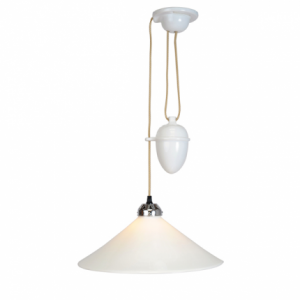
Over the table will be a hanging light from Rejuvenation. I wanted one of the rise-and-fall pendants that were popular in the early 20th century and revived later in a mid-century modern version. In the US, only smaller pendant versions are available to go over islands, three in a row, or in small spaces. The one I would like to have is made in England and while a little pricy to purchase here, it would take too long to arrive. I also thought it was too small. But it turns out the one I got is about the same size. Here is an image of the rise-and-fall fixture:
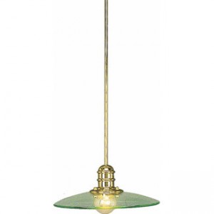
I picked the Rejuvenation light after ordering and returning another light below. The version with the brass finish only came 23” wide. I thought it would work, but when it arrived it was clearly too big.
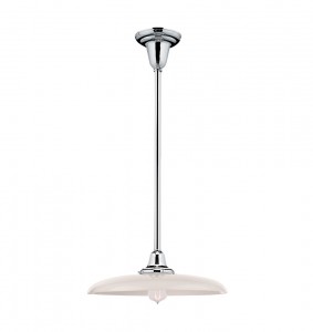
Here is a good picture of the one I got from Rejuvenation, though mine is unlacquered brass. You can see that the glass shade is more delicate than the one I returned. I will put some of the same wax on the brass that is on the sconces and hope the brightness will diminish with time. I also wanted a translucent shade. One of the reasons I chose this particular fixture is that it can take up to a 300 watt bulb. I plan to use 150 watts on a dimmer, not the Edison bulb in the picture. You can change the bulb without removing the shade and the smooth surfaces are easy to clean. In a few years an LED bulb should be available to provide the same light as the incandescent one. Still I wish it could go up and down.
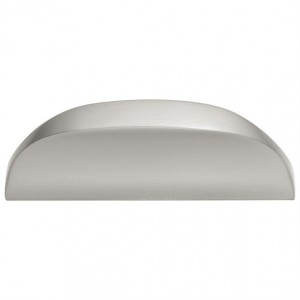
Knobs and pulls—While checking out the knobs and pulls at Menards, I fell in love with the feel of this pull.
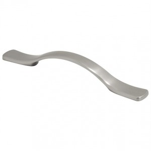
My hands are not always dry when I need to open a cabinet. In the old kitchen the cabinet finish behind most knobs is worn from cleaning. The finish wasn’t that great on the old cabinets anyway, but knobs and pulls should be easy to clean and make it easy to open a drawer or door without getting it soiled. This pull is going on all cabinets except the large pantry unit. There the pull would look too wimpy. The image below is the pull for the pantry. It has a good feel too.
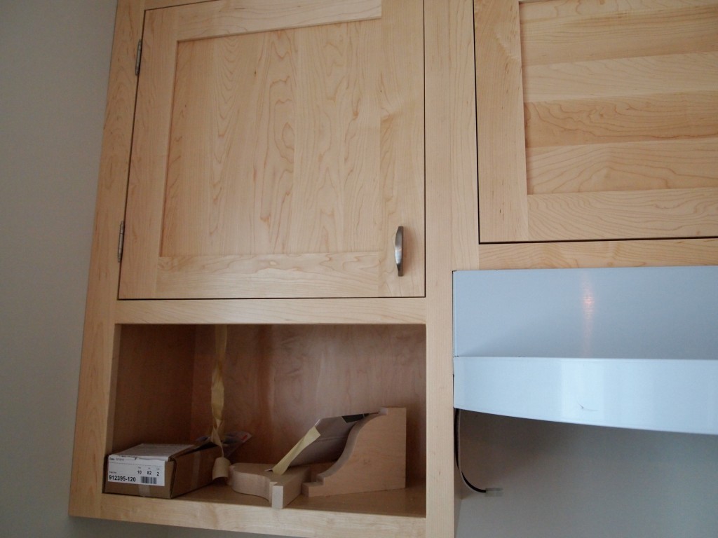
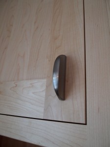
Here is the small pull installed on a cabinet door.
The finishes in the kitchen are brass, chrome, and satin nickel. I don’t mind mixing things up. The light fixtures in the “public” spaces in the house originally were brass as is the original window hardware. I thought it important to maintain consistency, so the new kitchen has brass light fixtures and window hardware. I would have had chrome cabinet pulls, but the pull I liked didn’t come in chrome. Chrome is much easier to keep clean and it is a classic finish. Satin nickel, like subway tile, is a bit overused these days. But they are classics, too.
The last thing to select is a back splash material. I will wait until the counter tops are in to make a decision.
The next time I post about the kitchen it will be nearly finished. That should be in about two weeks—or more. The plumber, electrician, counter installer, painters, and floor finishers each have work to do.

Leave a Reply
You must be logged in to post a comment.