June 5th, 2014 § § permalink
This post is focused on the shiny surfaces in the kitchen. Right now nearly all of the objects are in boxes and may be installed in the next week or so.
Faucet—Before I saw one up close, I thought I would like one of the commercial faucets with the fancy sprayer. Those things are huge and I want to keep things simple and open. I am very happy with the faucet in the old kitchen because the faucet head swivels as does the arm, so you can reach the whole sink area. This Kohler chrome faucet in no longer in production, but a few of them still exist in inventory. The flat wing shaped handles make it easy to turn the water on and off with the back or side of your grimy hands . Their shape makes them easy to wipe clean. Kohler no longer makes the same handles that I have now so I am going to switch the old handles to the new faucet. Below are the old and new versions.

Kohler faucet with the older style wing handles. I will take these from the old faucet and put them on the faucet in the new kitchen.

Kohler faucet with the new version of the wing shaped handles. I will put these handles on the old faucet
Lighting—Decorators like to “layer” the lighting: general lighting, task lighting, accent lighting. By the time they are done, the ceiling is full of pot lights and throughout are fixtures that are hard to clean and with bulbs located in delicate shades. Here is an example of what I mean in an otherwise wonderful kitchen.
Pardon me while I rant. Nearly all islands or peninsulas in new kitchens are lit by three pendants and counters lit by under cabinet lighting. I can only imagine the bank of switches that control everything. None of this for me. In addition, I am committing the worst lighting sin by having a fluorescent fixture in the kitchen area. I have one now and it works fine with no shadows cast. Fluorescent bulbs get a bad rap because old ones cast a bluish light and people didn’t like how their skin looked in the light. Nowadays bulbs come in a wide selection of temperatures so they all don’t have that blue cast that people complain about.
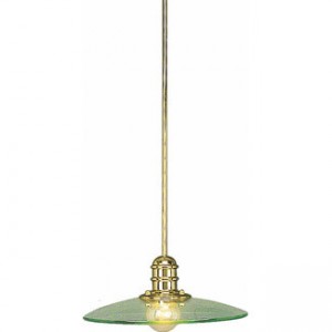
For a bit of bling, over the windows will be two sconces made by a company called Cedar and Moss. The finish in the image below is matte black and bulb is an Edison bulb. The Edison bulb is now the fancy of the lighting industry and will soon be dated. It is an incandescent and only comes in a 60 watt version. My sconces are brushed brass and I will use small LED spotlights.
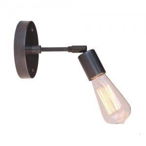
Imagine this in brushed brass.
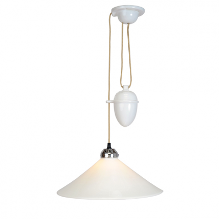
Over the table will be a hanging light from Rejuvenation. I wanted one of the rise-and-fall pendants that were popular in the early 20th century and revived later in a mid-century modern version. In the US, only smaller pendant versions are available to go over islands, three in a row, or in small spaces. The one I would like to have is made in England and while a little pricy to purchase here, it would take too long to arrive. I also thought it was too small. But it turns out the one I got is about the same size. Here is an image of the rise-and-fall fixture:

Cobb Rise and Fall lamp.
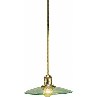
I picked the Rejuvenation light after ordering and returning another light below. The version with the brass finish only came 23” wide. I thought it would work, but when it arrived it was clearly too big.
I sent this one back because it was too big for the space.
Here is a good picture of the one I got from Rejuvenation, though mine is unlacquered brass. You can see that the glass shade is more delicate than the one I returned. I will put some of the same wax on the brass that is on the sconces and hope the brightness will diminish with time. I also wanted a translucent shade. One of the reasons I chose this particular fixture is that it can take up to a 300 watt bulb. I plan to use 150 watts on a dimmer, not the Edison bulb in the picture. You can change the bulb without removing the shade and the smooth surfaces are easy to clean. In a few years an LED bulb should be available to provide the same light as the incandescent one. Still I wish it could go up and down.
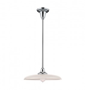
This is the one that will be in the new space although mine will be brass.
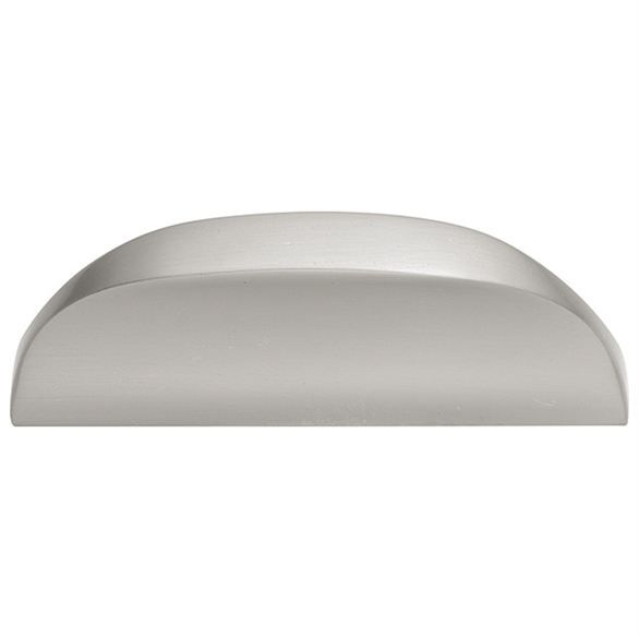
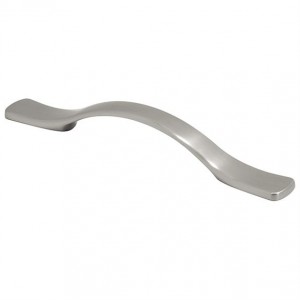
Knobs and pulls—While checking out the knobs and pulls at Menards, I fell in love with the feel of this pull.
Pull for the small cabinets and drawers
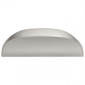
My hands are not always dry when I need to open a cabinet. In the old kitchen the cabinet finish behind most knobs is worn from cleaning. The finish wasn’t that great on the old cabinets anyway, but knobs and pulls should be easy to clean and make it easy to open a drawer or door without getting it soiled. This pull is going on all cabinets except the large pantry unit. There the pull would look too wimpy. The image below is the pull for the pantry. It has a good feel too.
Pull for the pantry cabinet doors and drawers
Here is the small pull installed on a cabinet door.
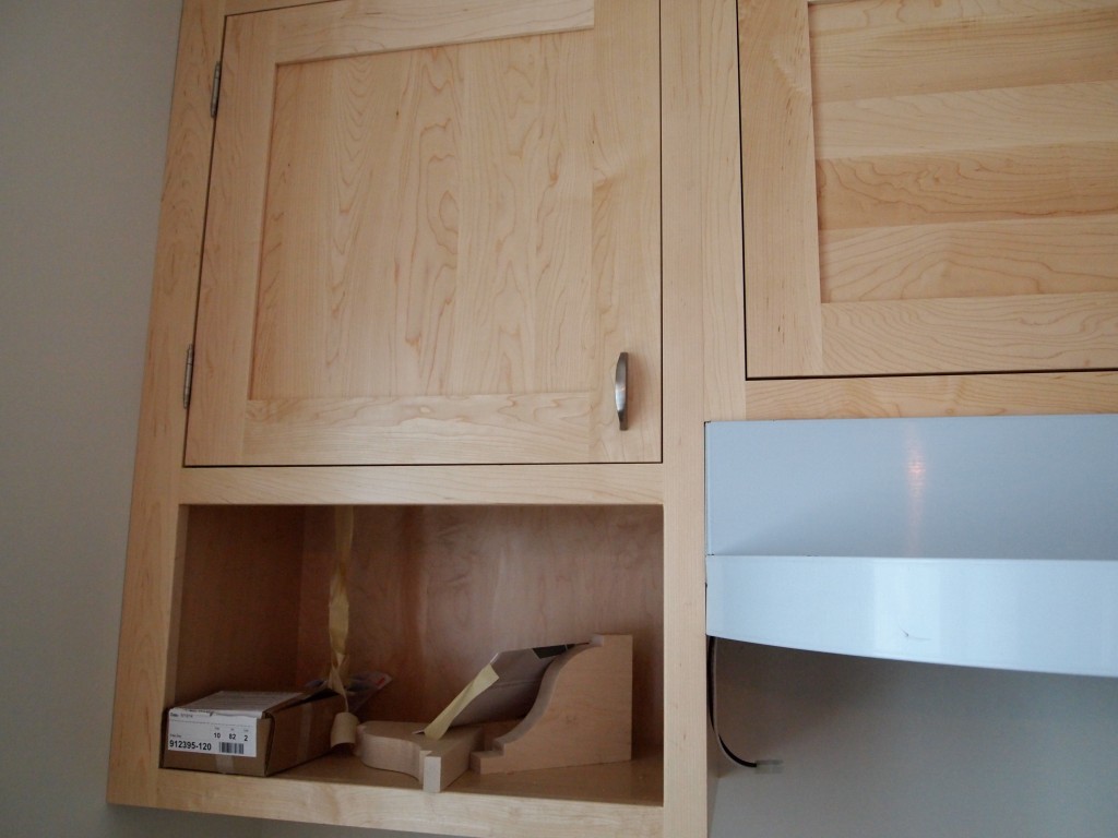
Small pull on a cabinet door.
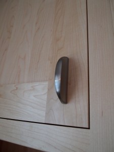
Close up of small pull on a cabinet door.
The finishes in the kitchen are brass, chrome, and satin nickel. I don’t mind mixing things up. The light fixtures in the “public” spaces in the house originally were brass as is the original window hardware. I thought it important to maintain consistency, so the new kitchen has brass light fixtures and window hardware. I would have had chrome cabinet pulls, but the pull I liked didn’t come in chrome. Chrome is much easier to keep clean and it is a classic finish. Satin nickel, like subway tile, is a bit overused these days. But they are classics, too.
The last thing to select is a back splash material. I will wait until the counter tops are in to make a decision.
The next time I post about the kitchen it will be nearly finished. That should be in about two weeks—or more. The plumber, electrician, counter installer, painters, and floor finishers each have work to do.
June 4th, 2014 § § permalink
I’ve been looking at kitchen images on the web for at least five years and in magazines virtually forever. One of the best places to look is Houzz where I have some Ideabooks full of my selections from the Houzz posts. You can check them out here:
http://www.houzz.com/ideabooks/users/evelyn
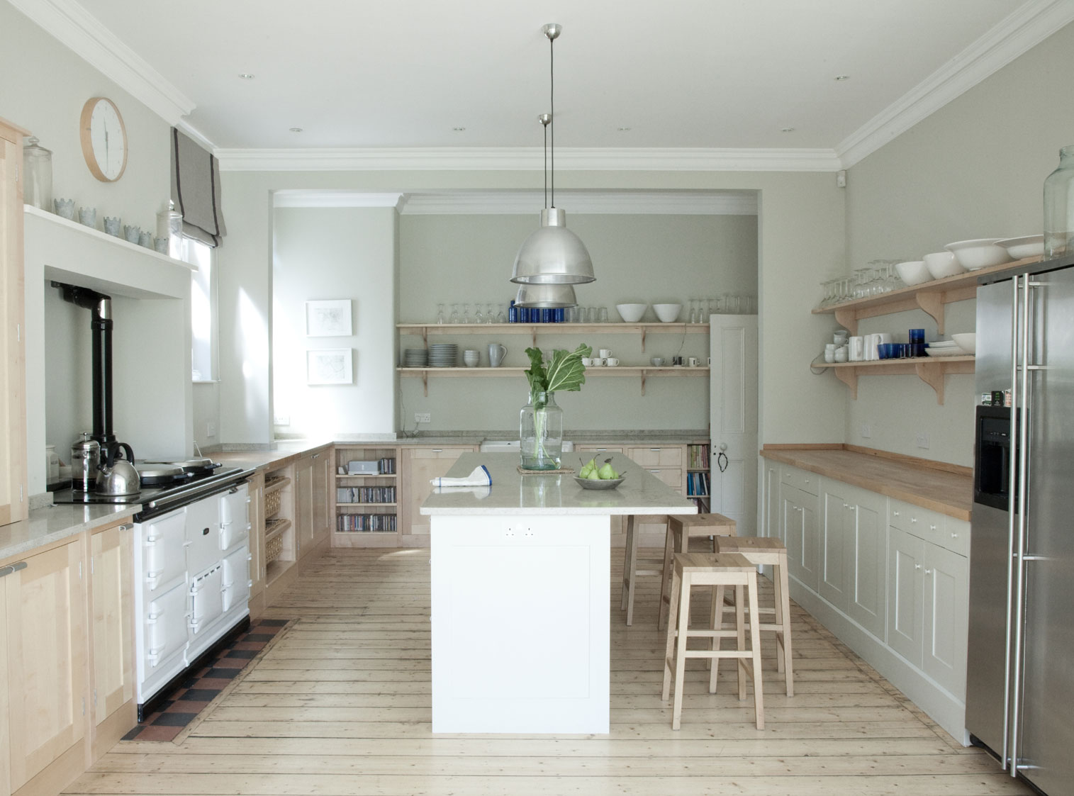
There is at least one thing in each image that caught my attention. But the picture that best captured the look-and-feel I wanted wasn’t on Houzz. I think I first saw it on the blog “Desire to Inspire.” Here it is:
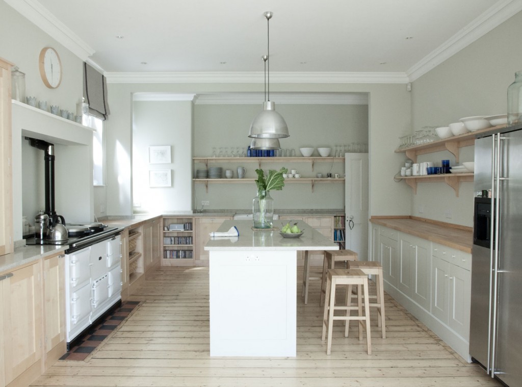
What I like about it is the color palate, the light wood of the cabinets and floor, the open shelves, both marble and wood counter tops and the fact that the appliances didn’t match. This image drove my selections while I kept in mind the age of the house, the size of the space, the light from the windows, and how I would use the room. It will take two posts to discuss everything.
Floor and Paint—As I mentioned before, the good maple floor was staying even though I would have preferred porcelain tile. A previous post discussed the paint which, now that I have looked at it for several weeks, is even better than I hoped. In late afternoon light it has a bluish tone, on a cloudy day looks grayish, in full sun can look more white. It takes on the hue of the light coming through the windows. Just wonderful.
Cabinets—I have some of the original cabinets from 1925 in the basement, some from a 1960s era remodel in the garage, and, of course the current kitchen cabinets that went in in 1985. This time I am using Shaker style like the 1925 version, but natural maple like the inspiration photo. The Shaker style can work in a contemporary, transitional, or traditional kitchen. There will be only a few upper cabinets in order to keep the open feel of the room. In the place of some uppers there will be shelves with custom brackets that match the shape of the brackets supporting the living room fireplace mantle.
The natural maple finish is the brightest, most user friendly finish. Paint or dark stains when dinged or damaged are hard to repair or refinish. Natural wood is more forgiving and develops a gentle, worn patina.
The cabinets are installed, but the counter tops, pulls, and some trim are not finished. Here is what the cabinets look like now.

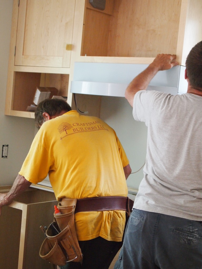
Mike and Rick install the range hood. The hood has a temporary white film to protect the stainless finish.
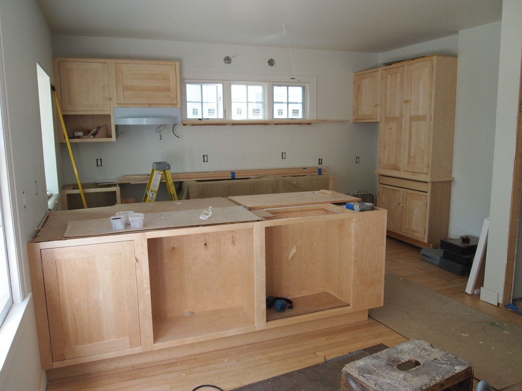
The cabinets and range hood are in. Still a lot of work ahead.
Counter top and sink: I spent way too much time researching counter tops. Thanks to a Christmas gift from my son, the main counter top material is quartzite. Quartzite looks like marble but doesn’t have the porosity and softness of marble. Here is a picture of the slab.
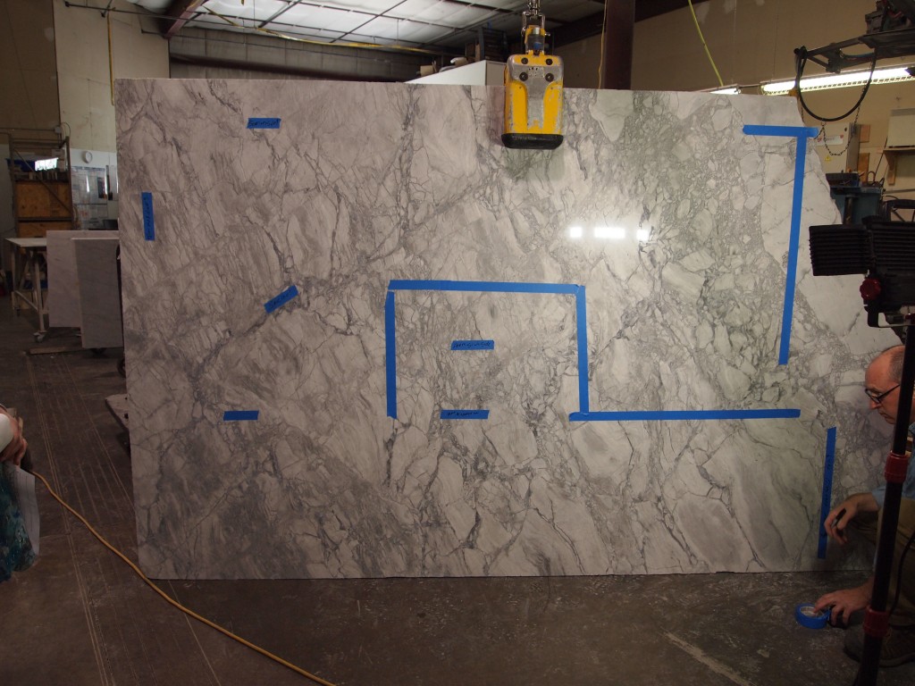
Quartzite slab from which the counter tops will be made. The blue tape marks out the sink and other cutting information.
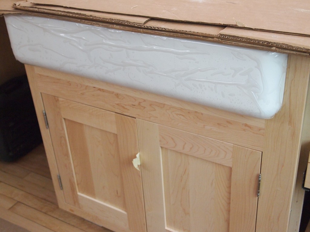
I wanted a stone top because I wanted an under mount, apron front sink. Otherwise laminate would be fine. Surprisingly, I don’t mind the plastic of laminate, but do mind the plastic of Corian-like surfaces. Quartz, another man-made material is as expensive as granites and other stones. Quartz is nearly indestructible and comes in a wide variety of colors and effects . Marble is relatively cheaper. I chose the 30” Kohler Whitehaven enameled cast iron sink. A small surface will have a butcher block top for rolling out bread and pie dough. That area will also be three inches lower than the other counters: a better height for rolling and mixing.

The Kohler Whitehaven sink in its cabinet.
Appliances—My dishwasher died two days before last Christmas. I didn’t replace it until after the New Year. It’s amazing how you can get by without a dishwasher—even with house guests and holiday entertaining. My garbage disposal died four or five years ago and I have lived without it since. I compost vegetable scraps and besides, the dishwasher manufacturers don’t want you to rinse dishes before loading. The city is about to start collecting compostable kitchen waste soon, so there will be no need for a disposal. My old Dacor range is in good shape and is staying, this time with a proper exhaust hood by Zypher. The new Samsung refrigerator will be counter depth with a smaller capacity than the old GE one that is 28 years old. The Samsung doesn’t have a water or ice dispenser and is white. I will get a small under counter beverage cooler that will go where the dishwasher used to be in the new mud room/butler’s pantry/bar. That will keep the traffic from the kitchen.
The next post will be about the shiny finishes—faucet, lighting, and cabinet pulls.
June 3rd, 2014 § § permalink
When we first moved into the house in 1985 we remodeled the kitchen. We didn’t really “remodel” because there was barely a kitchen there. The previous owners had removed most of the cabinets, there was a free-standing stove, a small refrigerator, and new cheap linoleum. The best you could say was that it was functional and clean. The house cost much less than we were prepared to pay, so we used the money to have a new kitchen within a few months. That kitchen worked ok for several years when it became apparent that a galley kitchen with doors at each end created traffic jams and provided no immediate place for muddy shoes and snowsuits. As the kids got bigger we just started using the front entrance where there was more room—even if it was the living room.
Years went by before I had the time and inclination to think about a kitchen again. My first design bumped out the east wall of the current kitchen and added a mud room on the back. I started by using SketchUp. You can see one of the earliest versions below (Click to enlarge). I played around with this for a year or so and was ready to move ahead. After a visit to the city zoning desk, I discovered that I couldn’t carry out my plan because I would need something called an “area exception” because I would reduce the size of the side yard below the code minimum. An area exception is a formal procedure to get permission from the city and my neighbors to do what I wanted. I decided to put my kitchen plan aside for a while.
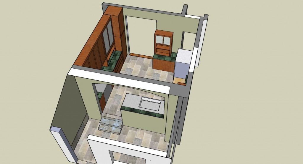
Kitchen and mud room plan in old space made using SketchUp.
After a few other demands on my time, including retiring, I was finally ready in late 2012 to get down to business. By then I decided not to bump out the kitchen, but to have the new kitchen space in two of the downstairs bedrooms. I came to this conclusion because, as I thought about it, the existing kitchen was above a crawl space and moving the plumbing would be a nightmare. It just made more sense to make the old kitchen a mudroom and add space upstairs to compensate for losing two bedrooms. Rick, the contractor, said I would have to wait until Fall 2013 because he just started a big project. Meanwhile, I went back to the city in the summer of 2013 to see if my plan was on the right track. I asked about an “area exception” because the upstairs would violate the minimum width of the side yard. Much to my surprise, the code had been changed in early 2013 and I wouldn’t need the exception.
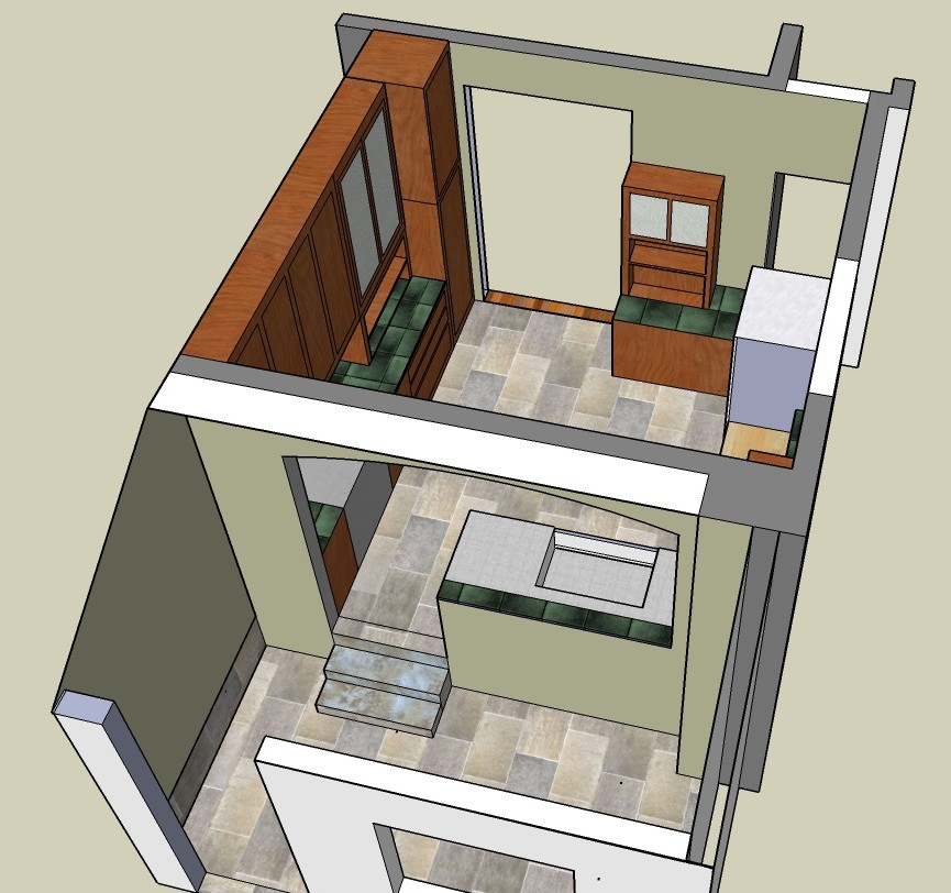
Below are a couple of SketchUp views of the new kitchen plan. It is basically still a galley, about the same width as the old kitchen and about two feet longer. The real difference is the peninsula and the absence of many upper cabinets. The cabinets in the mudroom would provide plenty of storage for items I used less often.
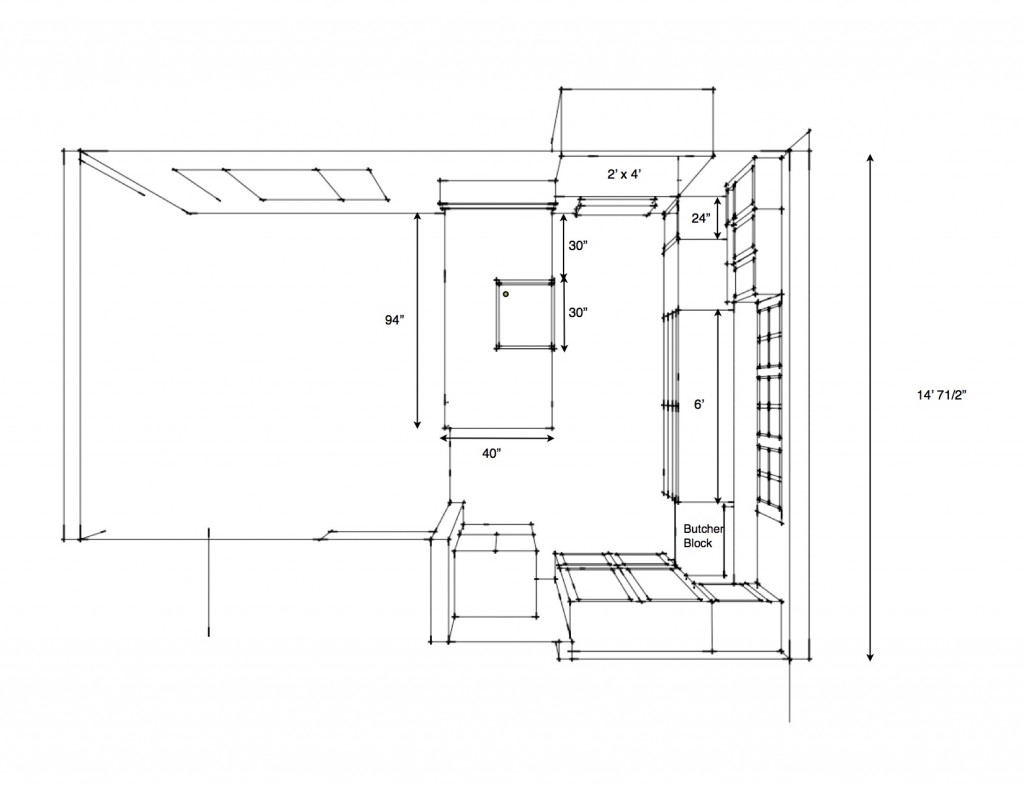
Layout plan of new kitchen.
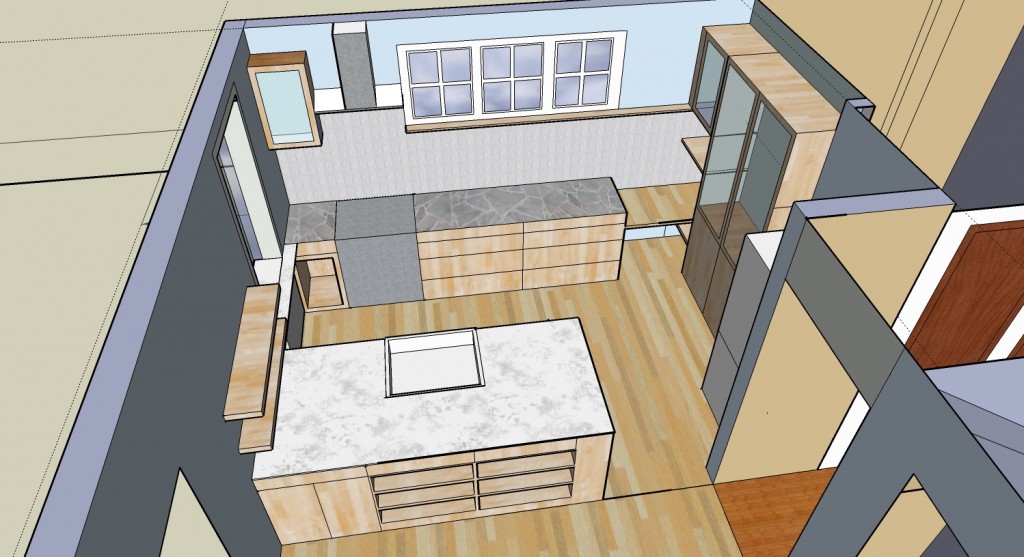
New kitchen plan
The layout emerged from some fundamental considerations. First thing is to locate the basics: sink, range, and refrigerator. While it would be nice to have the sink under a window, there wasn’t a window that provided a nice view of the back yard. In this climate a sink shouldn’t be on an outside wall anyway, hence, the peninsula was the logical place. Next, the refrigerator should be located for easy access. People shouldn’t have to walk to the back of the kitchen to get to the refrigerator. And the range should be next to a pretty good length of counter. You should be able to have the oven door and dishwasher door open at the same time.
The other major consideration was the size of the new windows. The existing windows in the kitchen part of the room had to go. They were narrow and a pain to open and close and not original to the house anyway. I decided to reduce the size of the triple windows because the view was of the side of my neighbor’s house. The double windows facing south were to become the garden window to provide a mini-greenhouse. Below are photos before and after.
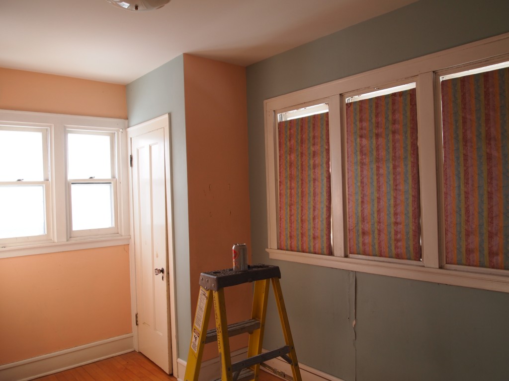
Windows in small first floor bedroom. The greenhouse window will go where the double window is and the triple windows will be cut in half horizontally.
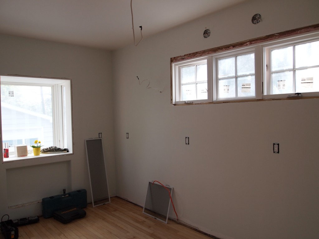
New windows in kitchen.
In the next post I will talk about the lighting, finishes, and cabinets.